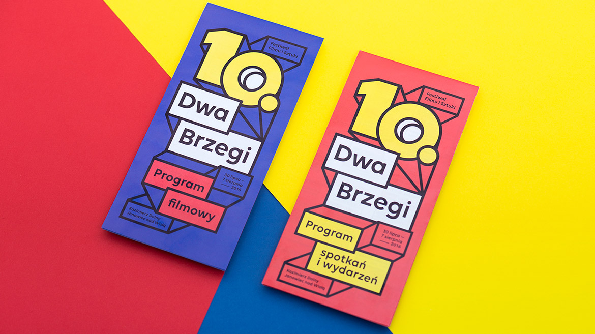
In 10th edition Zuzanna Rogatty followed the theme of cinema screens from previous edition (9th Two Riversides — click here), which turned out to be very recognizable and identified with Festival. She developed the theme, making it more complexed, colours are more vibrant. But 10th anniversary edition required not only refreshing but also, obviously, a big ’10’ on the poster. She took it as a great opportunity to develop it to the whole set and make a typographic visual language from them. They were used in e.g. film programme and festival daily newspapers.
Once again, a key to success was to prepare flexible and responsive visual system which can be easily stretched to different ratios. Many mixed promotional materials were prepared for the festival – from huge banners at the stage to pins and postcards. Big part of them were prepared in-house by different sponsors like T-Mobile, Mercedes Benz and TVN. That’s why it was significant to keep visual identity easy-to-use, simple and flexible.
Art direction / Graphic design — Zuzanna Rogatty
DTP / Graphic design— Radosław Bućko & sponsors


